
Rachel Livedalen


Rachel Livedalen is an interdisciplinary artist with a particular interest in print media. Her creative research explores contemporary femininity as seen through the lens of past histories and mythologies. This usually involves the study of social practices, familial roles, and cultural phenomenon. Rachel has exhibited her work widely and is currently an Assistant Professor of Printmaking at Texas Christian University. She received her MFA from the University of Iowa in 2014 and her BA in Studio Art and Art History from the University of Virginia. She currently resides in Fort Worth, Texas.
Statement
My creative research focuses on contemporary girlhood and womanhood through the consideration of historical socio-cultural symbols and mythologies, as well as how these forces intersect at the present moment to create a complicated relationship of gender identity and expectations.
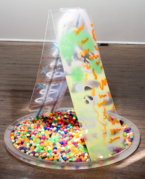
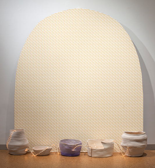
While trained as a printmaker, I infuse my interdisciplinary work with drawing, sculpture, installation, and performance. Consistently woven throughout my work are themes regarding the multiple, repetition, and pattern. These themes are intrinsically tied to print media and allow a larger dialogue about the denial of the ideal to emerge within my work.

Q&A with Rachel Livedalen
by Sidney Mullis
Hi Rachel, what led you to this work?
Oh man, a lot of things! I’ve been working with ideas of gender and representations of femininity for a while now. Previously I thought that in working with such an important topic the way to approach it was to use decisive metaphors and materials with a muted color palate. The idea was serious so the work had to look serious too. What led me to this recent work was thinking more about myself. I was always fighting my love for “girlie” things, and I think that was because I was in art school. Someone in grad school actually said my work was girlie and meant it as a criticism! That’s fucked up! Instead of fighting my love for an aesthetic that can be thought of as silly, I thought about why I was drawn to it. It’s because my adolescence was defined by growing up with 1990s Girl Power. And because of that, I will tell you what I want what I really, really want. I’m not saying I want to cover everything in kittens and rainbows (not yet at least), but I’m able to draw on numerous associations like Lisa Frank, pop music, Carrie Bradshaw, reality television—anything that could find a place within the work. Because of this, my work has become more playful. I’m still able to work with an important subject matter but create a different sort of entryway into the imagery and concept.
Ok, so that’s big picture. Specifically, I’ve been making work that combines canonical works of western art history with pop culture. Pop culture makes its way into the work through images, titling, digital mark making, or the color palette. I make big time leaps in terms of cultural references. I’m interested in this collapsing of history, a compare and contrast relationship, the fact that each element brings the other even more out of place. It’s a layering of histories that seem disparate but really aren’t. They’re related in a complicated way that has to do with femininity and how that is represented.
When did this interest in art history make its way into your work?
I studied art history alongside studio art while I was in school, so I’ve always seen them as connected. Art history provides an interesting context for how images can become larger cultural narratives and symbols. For instance, Greco-Roman sculptures become emblems of that moment in history. These works can also only be seen from a contemporary perspective, which impacts our interpretation of not only the artwork but also the culture it represents, and how we relate to that history. Works of art history are beautiful but loaded. I like working with images that have a complicated history, especially in relationship to gender.
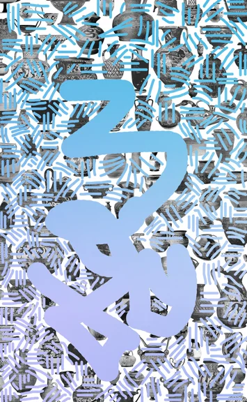
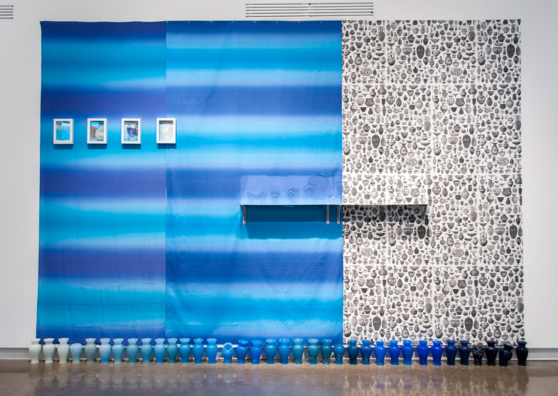
I’ve recently been working on a series of silkscreen and digital prints that highlight Roman sculptures of women. The work features images of heads that have been disconnected with their sculptural bodies over the course of time. These sculptures of women can now only be interpreted as a disembodied head displayed on a pole. Often the heads are also missing noses and other parts of their face. These beautiful sculptures are cultural icons but display an inherent violence in conjunction with the personage they portray.
How do you mine for your historical material?
I scan any historical images from printed materials, typically old art history books. Sometimes I order books that I think will contain the type of image I’m looking for, other times I look through the books I’ve collected on my bookshelf. The reason for scanning the image versus finding it online is that I have more room to manipulate the image; it’s a higher resolution. I prefer older books because the printed quality is coarser. I scan small images at a ridiculously high resolution, so I can enlarge them ten fold. That way the dot matrix (the series of tiny dots that make up the printed image) becomes visible and acts as a screen between the object and the viewer.
Could you speak about your interest in multiples and print media and how this communicates the denial of the ideal?
My favorite aspect of print media is the repetition and idea of the multiple it invokes. When you have many of the same thing, or have something that could be reproduced, it’s not as precious. The denial of the ideal develops within that repeatability. An image or an object is no longer a singular special entity; it’s hard for something to be ideal when it is one of many.
You merge digital and screen-printing so beautifully and effortlessly. Will more anachronistic printing methods, such as lithography, make its way into the work?
Most likely. I started out with slower printing methods like lithography and intaglio. It took me a while to work with digital printing. I thought it was cheating, because it was mechanical and much faster than other printmaking methods. Then I thought to myself, first, the idea of digital printing as cheating is stupid, and second, if I want to work with reproducible images that link to cultural commodities it makes sense to actually work in the realm of commercial printing. That’s why you’ll see professionally printed wallpaper and fabric in my work also. It made sense conceptually to send out my design to be commercially printed rather than attempt to mimic it through hand printed methods. I’ve been screenprinting on top of large digital prints recently. Screenprinting too has ties to commercial printing. It also allows me to be more spontaneous as it’s easier to shift images around, change colors, and layer images on top of one another. The works become more like collages than editioned prints.
I’m very much a printmaker. What I mean by that is even when I’m not working with traditional printmaking processes, I’m still interested in reproducing images and considering conceptual approaches to the multiple. Sometimes I’ll just get the urge to make a lithograph, or an etching. Making traditional prints helps me think through larger ideas that may be better suited for digital works, sculptures, or installations.
There is something so hilarious when perusing your website and going from a work titled Announcing the Annunciation to That Episode in Season 6 When Carrie Finds Her Necklace. How does humor function for you?
Humor can be a powerful tool, especially if there are some teeth to it. Sometimes I write titles to bring up different associations or to poke fun at the images, materials, or cultural references involved in the pieces. Lately I’ve been drawing on 1990s Girl Power as a means of titling and finding source material. I’ve used lines from Spice Girls songs or phrases from Clueless in my titles. These are things I’m thinking about when making the work. There is a humor involved in the reference, a nostalgic humor especially. These references are funny to me, but I genuinely love all these things. So when I choose titles or imagery that refer to that, I mean for it to be somewhat humorous but also honest.
In addition to your titles, you often employ text. How do you choose text? Specifically, could you discuss the presence of the word “revere”?
I choose text for my works like I choose images for my works- they are bigger than what they actually are. The text and the images are referential and stand in for bigger ideas. When working with text I will pick a word or a phrase that seems simple, but is much more complicated.
The word “revere” was printed again and again in multiple works for an exhibition I did centered on the cultural representation of the Virgin Mary. I was interested in how a religious personage, a woman specifically, could transcend religion and influence popular culture from so many directions. I was looking at religious works of art history as well as thrift store trinkets. Overall, I was being critical of how representations of the Virgin Mary are manipulated to influence ideas of femininity and female sexuality. I chose the word “revere” and repeated it many times because it means to be in awe of something, and it doesn’t only have a religious connotation.
When did you begin integrating the popular television show, Sex in the City?
While working on a body of work surrounding the Virgin Mary, the same work I mentioned earlier, I found myself focusing on the idea of virginity. I felt I needed to balance the lack of sex with a contemporary example of a celebration of sex, specifically in regards to female sexuality. So, voila Sex in the City. That choice was partly because it’s not uncommon to hear someone say, “you’re such a Samantha!,” which I find hilarious. The characters are larger than life. The whole narrative goes beyond fiction. I had a college roommate who moved to NYC to live that life, or try to at least. I love the show and have been interested in how it was and is situated within pop culture. The show has also been discussed as an example of post-feminism, especially considered when it was first released. It was important to integrate that perspective into my work.
How do you feel about our generation’s relationship to history and memory in a digital age? What about younger generations?
There’s a strange relationship to history that happens in the digital age. On the one hand, nothing is physically tangible; there’s no hard copy. On the other hand, I can google anything and find out about it and its history. The internet provides its own kind of memory. I find myself making connections between disparate things due to this kind of digital memory. Memory and history in the digital age have less to do with storytelling and actually remembering and more to do with images and associations. I think this will continue to expand with younger generations.
Could you talk about your collaboration with The Printmakers Left? How did this start? Who is in the group? Any upcoming collaborations for the future?
The Printmakers Left is a group of about 27 artists, mostly printmakers. The members of the group are from all over the world, but almost everyone has a connection to the University of Virginia, which is where I went for my undergrad. The Printmakers Left was started over ten years ago by artist Adam Wolpa. It has since grown thanks in part to Adam’s collaboration with Dean Dass at UVA. I was invited to work on a project with The Printmakers Left about three years ago and have enjoyed being a part of a collective. There’s great energy when you’re working with artists towards a common goal. The Printmakers Left works on collaborative installations, portfolios, and self-published artist books. One project involved every artist receiving a workbook with specific prompts and blank pages to fill with material. Each artist completed their workbook, mailed it to UVA, and the books were mined for material for an exhibition and a publication. There’s an upcoming project called Hinterlands in the works…stay tuned.
You recently graduated with your MFA in Printmaking from the University of Iowa. Congrats!! What was your transition out of school like? Any advice for others as they make similar transitions?
After graduating with my MFA, I immediately transitioned into a tenure-track teaching job at TCU, with a whole new set of challenges! My first year of teaching was insanely busy as I moved to Texas, had new courses to prep for, and a printshop to revitalize. I was not able to work in my studio as much as I wanted. Slowly I strategized how to maximize my studio time, like leaving parts of the day open and not agreeing to meetings during my set “studio time”. I also work in my studio at least one day every weekend. While it’s tempting to sleep in and hang out all day, the weekends are uninterrupted time I can spend working. It’s kind of funny, but I look forward to time off so I can get work done!
My advice for others coming out of graduate programs is to be OK with being “in transition.” You might be moving to a new place, moving into a new studio, starting a new job, or looking for employment. These are big things. It is OK to put your work on hold for a few months. Pressuring yourself for not maintaining a rigorous studio practice like that in graduate school will only make the transition more stressful. Once you’ve settled in to your new situation, focus on the work, and I mean really focus on the work. It’s hard not having constant feedback, so you need to be critical of yourself. Or, find a group of artists and start your own critique group. Invite people over for studio visits. Get feedback any way you can.
Is there anything else you would like to add? Any upcoming shows we can keep an eye out for?
I have a solo show in May at Erin Cluley Gallery in Dallas, TX that I’m very excited about!
Thanks so much for taking the time to share your work and talk with us!
To find out more about Rachel and her work, check out her website.