
KAVERI RAINA / LINGER STILL
Curated by Emily Burns in collaboration with ASSEMBLY ROOM
On view April 12–May 12, 2019


CATALOGUE ESSAY
Beyond this, beyond that: Kaveri Raina
by Megha Ralapati
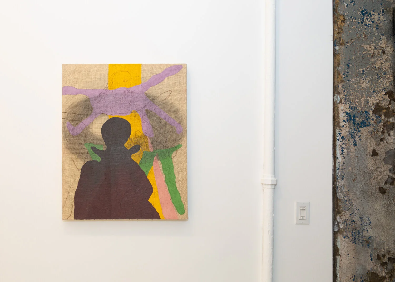
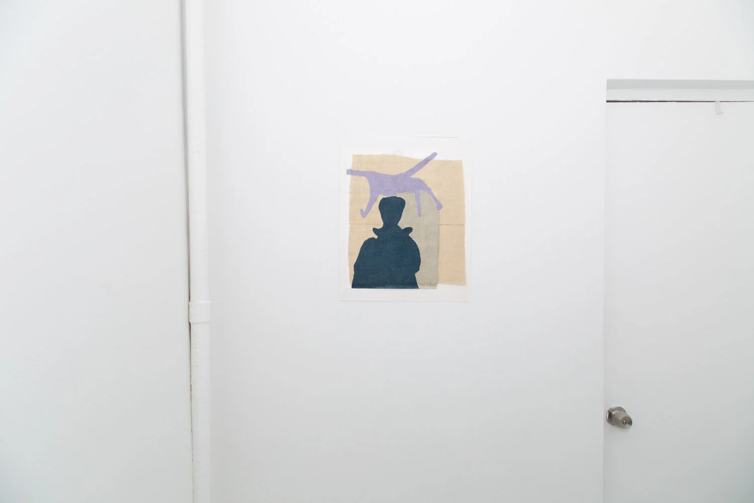
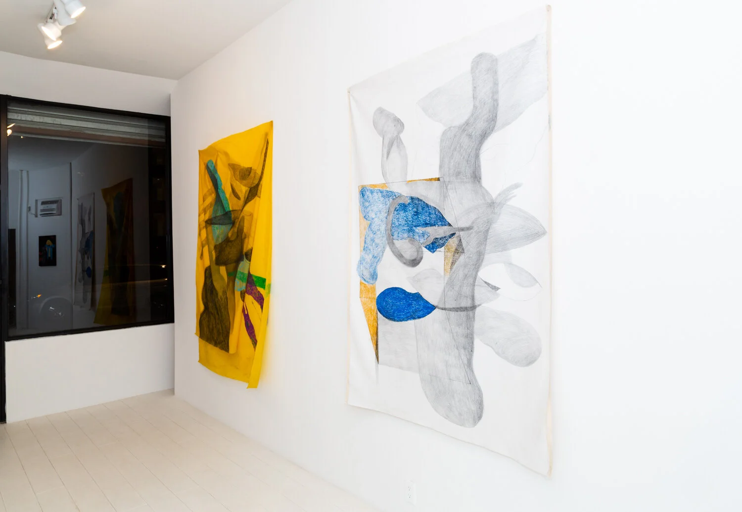
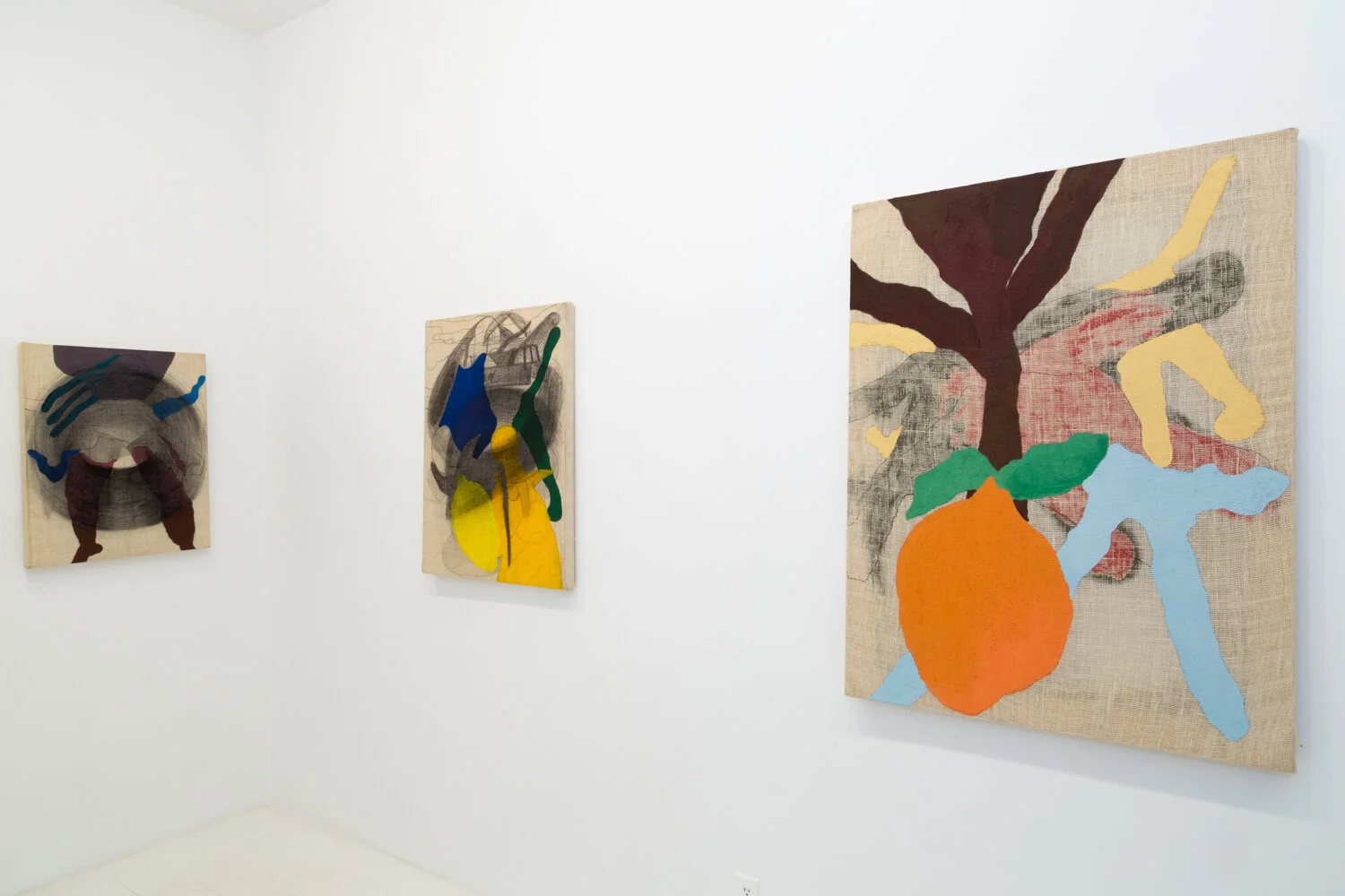
Kaveri Raina’s paintings arrest the eye. Their jewel-like color palette and rich pigments absorbed deeply into jute canvases create swaths of color that dance across the surface. Ungendered, anthropomorphic forms float through space, collapsing and leaping from foreground to background. Sometimes they’re decorated with unremarkable ornaments: eyes, little capsules, messy dashes, repeated. A visual mantra. Canvases avoid orientation: up is down is sideways; paint creeps from front and back. But that palette. Those colors: exuberant, at times, portentous. Ambrosial.
In Raina’s hands, color is clay, and her facility to mold it, pair it, complement and correlate is unparalleled. But she’s anxious. These aren’t beautiful paintings; Raina’s drawn to off-kilter schemes, pairs that don’t quite match or clash. They relate, though a bit absurdly. It’s as if a natural finesse for color requires tempering, setting the lid askew atop a bubbling pot to contain it. In cooking, tempering means to slowly toast spices like red chili’s, mustard seeds, cardamom pods, patiently, deliberately to liberate their oils and create an explosion of flavor in whatever you’re making.
Drawn to the poetic, Raina’s father named her for the sacred Kaveri River, one of India’s largest, which was supposedly created when Sage Agastya’s kamandalu (water vessel) tipped, pouring water through the land. The Kaveri came to symbolize motherhood and motherland; land that today is highly contested, deeply scarred. Born in New Delhi, Raina’s family hails from Kashmir, a land known for its unimaginable beauty. Kashmir is also the physical and spiritual border between India and Pakistan, itself torn apart during the 1947 Partition by a fading, flailing British Raj. It became the site of unimaginable bloodshed and a land dispute still piteously unresolved. Kashmiris live in fracture, neither here, nor there.
Moving to the US along with her family at age 11, Raina is part of what some call 1.5 Generation—the group of immigrants who relocate to the US as children and who have a curiously divided affiliation to American culture. Distinct from adult immigrants and their US- born children, 1.5 Gen people have an especially splintered identity. They read as American, but not entirely. (1) The perspective is unique—a bird’s eye view, suspended above the ground with an ability to see what’s invisible to others, imperceptible to the native eye. It’s the non-native (or the semi-native in Raina’s case) who counter-intuitively has the fullest view of American-ness.
Notions of foreign vs. familiar don’t quite apply to Raina’s color schemes, however. The Indian eye might immediately recognize her vivid combinations and patterning as drawing on varied practices from the subcontinent, from bandhej block printing, textile traditions, color symbology (yellow and red are holy colors), and sacred ornamentation. (2) At the same time, there is something undeniably striking in these paintings to an eye less familiar with decorative traditions from the region; they compel anyone drawn to color. For Raina, color is a tool used to trigger memory, and she has developed a process of remembering through color. A path to unearth lost memories. Excavation through color.
Many of Raina’s color choices originate in the natural materials she grew up around. Turmeric yellow is significant which, for the artist, represents a color from before. She uses it sparingly, as it might be used in cooking; a little bit goes a long way. Raina recalls her mother cooking with turmeric, mixing it with warm milk as a healing elixir, and as an antiseptic, applied directly to the skin for cuts and scrapes. She uses turmeric yellow paint as well as actual turmeric powder, applied to the canvas sometimes directly, savoring the residue that remains on her fingers, as her mother did while cooking.
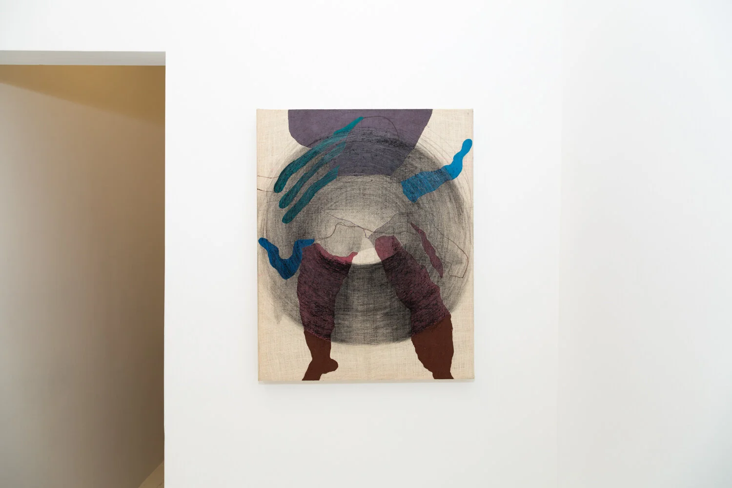
But, not all the memories are sweet. In Sense of Doom, an ominous figure, painted in subtle gradient from deep burgundy to black looms over a childlike figure, perhaps Raina, scrawled in graphite and overlapping other amorphous forms. This is a strange collage. There are limbs, human or animal, rendered in creamy mauve, violet and kelly green. A stripe of turmeric envelops the female figure, highlighting her face or obscuring it, as does the shady character. A circular vortex links the two subjects; they are now tied together without much hope for escape.
On one hand, Raina’s work deeply reflects her history of migration and displacement. Pulled from the comforts of an idyllic childhood in India, she grappled with the burden of understanding herself in relationship to an entirely new cultural context. She had to remake her sense of self in response to this otherness. Her work revels in its dislocation. Le mon to hover presents a chaotic layering of familiar forms: the same ominous figure from before, this time rendered optimistically in turmeric. A graphite vortex spins, pulling into its orbit a cheerful lemon, disembodied forest green limbs and what looks like a torqued torso in deep blue. A human trunk superimposed on top of what could be a car, a face, more limbs set off in the distance away. The image has been flattened, yet there is depth; objects hover suspended in space.
Hovering as a concept has preoccupied Raina for sometime: the suspension of one’s perspective, hanging just above, visible, present, yet distant. The work asks what it is to linger, to remain between here and there.
Given this liminality, where does the work fit?
It’s tempting to align Raina with mid-century conceptual artists like Helen Frankenthaler whose “soak-stain” resonates with Raina’s technique of “pushing paint” through burlap canvases, creating controlled expanses of textured pigment; her own approach to the color field. Or, perhaps Morris Louis, influenced himself by Frankenthaler, who was known for his stained surfaces made by pouring transparent color in layers allowing each to overlap and absorb into the canvas weave. Likening Raina’s work to these pioneers of abstract expressionism seems beneficial: inserted into the Western canon, Raina’s work gains art historical gravitas, good pedigree.
But hers are not color field paintings. Color plays a significant role; she considers it indistinguishable from form. But Raina isn’t an abstractionist. Hers are discernible forms and figures. They may be amorphous, but they are present, collapsing distinction between figure/ground, between landscape/portrait, abstraction/representation. Tiptoeing between polarities. Oscillating, undulating, hovering, like Raina herself.
Perhaps, Francesco Clemente is a more apt comparison. Italian-born Clemente spent time living and traveling in India, and his own vibrant paintings of groundless, cartoonlike figures have achieved acclaim in large part due to their affinity toward Indian culture, philosophy and spiritual traditions, not to mention the labor of artisans he met there. Unlike Raina, Clemente left European comforts for India where he was enchanted by the very things that an artist like her would find completely commonplace: India’s irreverence, hybrid visual vernacular and quotidian spirituality. Where Clemente encountered the exotic, Raina locates solace.
Instead, maybe we can turn to India for more congruous relationships. Modernist painter Bhupen Khakhar worked much more directly with the figure than does Raina, though his jewel-toned colors and deeply personal references bear resemblance. Similar to Raina, sculptor Mrinalini Mukherjee explored the partition between figuration and abstraction in her fiber forms, fluently melding techniques, collapsing western-centered hierarchies between art and craft traditions. (3) Underrated painter Arpita Singh’s commitment to mark-making in its simplicity and meditation find an echo in Raina’s approach to mark-making as mantra.
In Advaita Vedanta, a branch of Hinduism exists a Sanskrit term neti-neti, which translates to neither that, nor this. It represents a methodology for searching for the real by identifying what it is not. Neti-neti is a philosophical approach to identification through negation. When put into practice, we can expand the notion of neti-neti into an idea of moving beyond this, beyond that. (4) When repeated as mantra, neti-neti encourages the practitioner to recognize they are not actually the things they identify themselves with, such as their passing feelings, their career, or the roles they play. Instead, neti-neti allows for the most expanded notion of identity, which is inherently hybrid and boundary-less. An identity that has been liberated.
Sources:
1 Rojas, Leslie Berestein, “Gen 1.5: Where an immigrant generation fits in,” 89.3 KPCC, https://www.scpr.org/blogs/multiamerican/2012/03/21/7963/what-is-a-1-5-where- an-immigrant-generation-fits-i/
2 “Kaveri Raina,” Maake Magazine http://www.maakemagazine.com/kaveri-raina.
3 “Phenomenal Nature: Mrinalini Mukherjee,” https://www.metmuseum.org/press/exhibitions/2019/mrinalini-mukherjee.
4 “Neti-neti,” https://www.yogapedia.com/definition/5325/neti-neti.