
Katie Barrie
Katie Barrie received an MFA in Painting & Printmaking from Virginia Commonwealth University in 2019, and a BFA in Art & Design from the University of Michigan in 2011. Born in 1987, she was raised in both the Midwest and Hong Kong. Her interests are centered in the excitement of color, global and local architecture, the role of design in influencing culture, and the potential of paint.
Statement
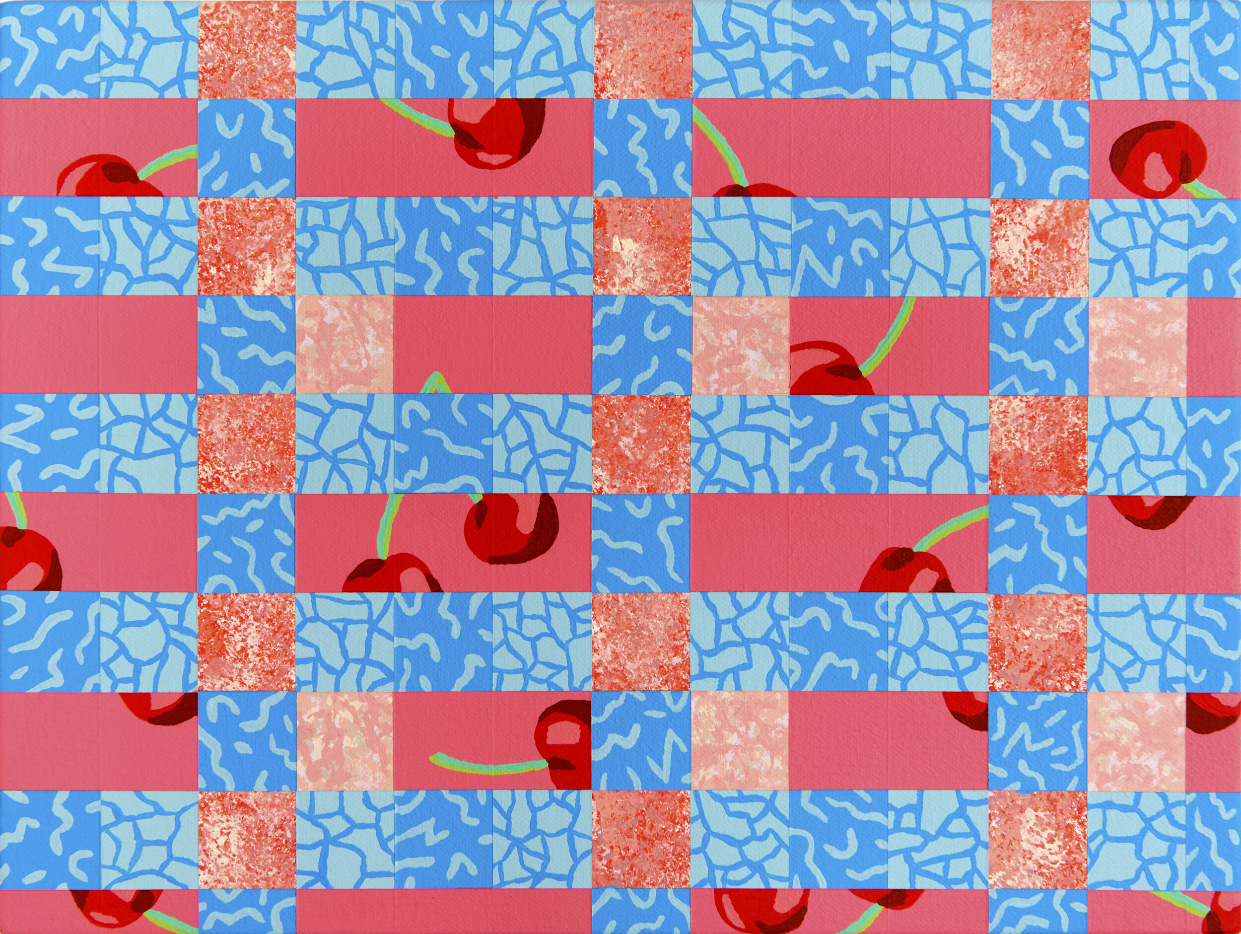
My work examines the aesthetics of leisure, the implications of good and bad taste, and what it means to live one’s best life. Considering the history of design motifs and the influence of color upon the human psyche, each painting contains references to patterns and modes of artifice that have historically been used to elevate or negate the status of a space. These include nods to terrazzo, stucco, sand, faux marble, the Memphis Design group, and color palettes found in spaces of leisure. My materials include a mixture of high and lowbrow: densely pigmented acrylic paint, natural and artificial sand, volcanic pumice, and cheap materials found at the hardware store. I use a formal, modernist painting language to elevate the artificial and superficial to the hierarchy associated with the moral underpinnings of modernism. By being entirely serious about the unserious, my work aims to question the value we assign to play and why tastefulness rarely aligns with fun.
My Sense of Purpose Was Derailed by an Unfortunate Bedspread, 2019. Highload acrylic on canvas, 11 x 14 inches
Interview with Katie Barrie
Questions by Andreana Donahue
Hi Katie. Do you have any early memories of art or art-making from growing up in the Midwest?
Yes. My mom was fantastic about always having art projects to dive into at any point. Our house had a ready supply of crayons, markers, popsicle sticks, pipe cleaners, glitter, paint, etc that I was routinely creating with. I also went to art classes at the Toledo Art Museum on the weekends. I remember being taken into the galleries and learning about Louise Nevelson right in front of one of her sculptures, and then making our own mini-Nevelsons out of paper towel tubes, wooden odds and ends, and black paint. It was a great way to learn about art history, while also stroking my very young ego into thinking I was capable of making museum-worthy art.
Over the years you’ve lived in LA, the Bay Area, and now Richmond, Virginia. What have been the most valuable aspects of living and working in these art communities?
I moved to LA after undergrad and it was a wild introduction to the larger art world. I was a studio assistant for a mid career artist while my partner at the time worked for a major artist pouring millions into their work. It was exciting and entirely overwhelming. But also one of those impactful learning experiences for your twenties to see how professional artists handle their careers and take care of their people. What I loved most about LA was all the ways in which young artists were creating their own spaces for art, experimenting with different formats and approaches. I was so naive at the time that it had never occurred to me to just make your own mini gallery in a living room, backyard, or garage.
On a whim after a break-up, I moved to Oakland to live with my best friend and my art took a back seat so I could focus on a stationary company I started with the dumb thought of “how hard can it be to run a small business?” As such, my life became completely consumed with trying to maintain and grow my little business, while also doing freelance work and babysitting for two incredible girls in Berkeley. But I got to know the West Coast craft scene quite well. I was completely in awe of how hard those makers hustled, and how many badass women were running their own successful businesses.
I’m in the midst of my third year living in Richmond, the first two of which I was swimming in grad school, so this year has really been about deepening my involvement in the art community beyond VCU. I love how tight-knit the artistic community is in Richmond. It’s a small city, so you’re actually able to attend most of the events around town and regularly see other creatives. I’m not lost in the sprawl of a huge city, nor struggling to manage the cost of living, so I feel more encouraged in my artistic endeavors. I have some big projects I want to take on in Richmond and while I’m nervous about the idea of starting a business again, I feel confident that it’s doable in a city like this, and that Richmond will benefit from having more art non-profits.
You recently finished grad school - what drew you to VCU? How has this experience shifted your perspective or the trajectory of your work?
Deciding to go to grad school was one of the best decisions I’ve ever made for myself. I visited VCU after being accepted, and it all just felt right: the people who would become my colleagues, the trajectory of a rigorous program, and Richmond being a smaller, more manageable city. During my first semester, I kept asking myself what on earth I voluntarily signed up for. It’s one thing to envision the mountain of work you’re going to take on in grad school, it’s quite another to live it. I adjusted to the rhythm and connected with some incredible mentors who really pushed my studio practice. My degree is in Painting & Printmaking, but I took a lot of classes in the Interior Design department that helped frame my work within the context of design history and theory. The conversations I had with my cohort in studio visits and critiques greatly shaped how my work developed and I’m still referring back to notes I made from a year or two ago when I’m planning new paintings. More than anything, my time in grad school turned me into a research driven artist. There’s always an investigation of references behind every piece I make.

Thirty-One Pieces of Furniture, Three Clocks, Ten Lamps, Eleven Ceramics, and Twenty-Five Hundred People, 2019. Highload acrylic on canvas, 30 x 24 inches
Can you tell us about your current studio?
My current studio is in my home in Richmond. It has high ceilings and large windows facing north and south, so I have beautiful light flowing in during the day, but also more limited wall space than I’d prefer. As a result, my paintings and reference imagery hang like an overly colorful Tetris game on every inch of spare wall. The at home studio is a funny business - on the one hand, I love being able to waltz in wearing pajamas and get some work done, but I also really enjoy having some physical and mental separation between studio and home. Ideally, my studio would be in a building with several other artists with energy to feed off of. I need privacy in my own space in order to focus, but I miss being able to step outside my studio door and saunter into a friend’s studio to chat. I need that nourishing socialization to balance out the solitude of my own studio.
Your paintings are largely driven by playful patterns and abstraction. Can you talk more about artists or design movements that have influenced you?
The Memphis Design group of the 1980s has been a huge influence on my work in the past few years. Memphis rebelled against good taste through postmodern design choices that were playful, gauche, and subversive. I love their brazen use of color and bold patterns, and how they utilized artifice and exaggeration. Memphis rests firmly in the club of those who are serious about the unserious.
I feel absurdly grateful that I live in a time when there are a plethora of women making extraordinary abstract paintings. Laura Owens is a long hero of mine. I am drawn to her continued investigation of the possibilities of paint and her embrace of middlebrow kitsch aesthetics. She routinely complicates what is real and what is artificial while giving a humorous salute towards the very act of painting itself. Rebecca Morris’ paintings are deliberate and imprecise at the same time, sophisticatedly casual. She thinks a lot about placement and formalism, and gives in to what makes her uncomfortable. I love that Charline von Heyl wholeheartedly celebrates the act of applying paint to a canvas. She uses decorative elements in her work, but never directly lets you in on the references, instead playing with ways to trap the viewer's gaze. Holly Coulis has been doing amazing things with form and color, her paintings are the best kind of eye candy. I’m a big fan of the lines she uses to separate one form from the next, experimenting with perception, allowing vibrations to happen as you get closer to the piece. And Tomma Abts just can’t be stopped, every piece is better than the last. She’s truly a master of abstraction.
I regularly refer back to Alex Katz’s paintings of summers in Maine, especially the beach scenes depicted in “Round Hill” and “Nine A.M.”; as well as David Hockney’s pool paintings, his own backyard pool, and the pool he painted at the Roosevelt Hotel in Los Angeles. Both of these artists have continued to be incredibly prolific well into their years, and I can only hope I can do the same when I’m in my eighties.
Most often you use velvety high load acrylics, fiber paste, molding paste, and artificial sand on canvas. What qualities attract you to these materials?
I started using highload acrylics while doing a residency at Golden Artist Colors in the spring of 2017. I had been using acrylic gouache on a large scale for the previous year and it was becoming a pretty absurd and expensive way of working. But I loved the velvety, matte finish of gouache. While at Golden, I got to experiment with everything they make while talking with paint technicians, and fell in love with their high loads. It’s the only paint I use because it handles so beautifully and checks all the boxes regarding pigment density, paint consistency, matte finish, etc etc. You can’t find the high loads in stores, you have to get them directly from Golden, so there’s a fun element where it feels extra special obtaining the paint. I have several custom colors from them as well; their paint technicians are masters at matching hues!
I later started incorporating various substrates that Golden makes into my paintings, notably their molding and fiber pastes, as well as pumice gel. (Yes, I drank all the Golden Kool-Aid). I wanted to break up the surface of my paintings and incorporate textures from the architecture I was references, so those materials felt like a natural solution. The pumice mimics the grit of stucco as well as becoming a stand-in for sand. The artificial sand found in my work is Rolatex, which is a substrate added to paint that is used on boats and docks to create anti-skid surfaces. It’s a direct reference to spaces of leisure but it can also be manipulated to refer back to what it is manufactured to replicate: natural sand. The texture of wet molding paste is similar to frosting, so I’m able to sculpt the material with palette knives and icing nozzles. When it dries, it hardens and takes on a more architectural quality. I use fiber paste to create a softened version of the concrete coating that is used for pool decks. They’re all quite fun to work with and I like to conduct material studies every now and then to explore what they’re each capable of doing.

For the Condo Walls of A Successful Career Woman, 2018. Highload acrylic, pumice, and molding paste on canvas, 14 x 11 inches
Can you talk about your interest in stucco, tile, and other decorative architectural elements typical of suburban homes?
I’m not necessarily interested in suburban architecture, but rather vacation homes and resorts, places people make a concerted effort to travel to, expecting a particular aesthetic. For the past several years, my parents have split their time between the two places my family regularly vacationed in while I was growing up: a lakeside summer community of cottages in northern Michigan and a sprawling resort with residences on an island in Florida. From spending so much time in these vacation lands, as well as locations I have visited around the world, I noticed certain design elements that were routinely used to evoke a sense of leisure. I started making note of these details as well as keeping an archive of pop culture references. For many of these decorative elements, they have a certain mode of operating in order for them to make sense. Out of context, they become tacky or lost in translation. I have a pile of vintage decorating books that offer guidelines for outfitting one’s home, along with ones geared specifically towards beach houses. While there are so many amusing elements to these publications, there are clear thorough lines throughout recent history when it comes to visually communicating leisure through design.
There are thoughtful surface variations in each work - from uniform, flat acrylic to gritty pumice to a thick, yet controlled application of molding paste. How much of your work is planned out and how much is improvisational? Can you walk us through your overall process?
My work is obsessively planned out via drawings and digital sketches in Photoshop before I ever start painting. For each body of work, I have a collection of references that I have drawn from my research that I want to focus on. Research is a huge part of my process: lots of reading as well as sorting through source imagery that I have taken myself or parsed through the Internet, screenshots from television and movies, and fabric and wallpaper samples from contemporary and historic design schemes. I’ll then make line drawings on paper, playing around with composition and form, before plugging those into Photoshop and inserting the various sources I have into different forms. It’s kind of a puzzle. I’ll take screenshots as I go so I can keep track of the ideas I’m sorting through. Typically, I’ll reach a point when something just feels right, or I’ll debate between a few different versions of the same painting. The digital sketches are all to scale of my paintings, so I don’t have to do complicated math to translate the scale shift from drawing to canvas. Once I have my final sketch, I’ll start measuring and drawing in pencil on a canvas. Anything with a hard line in my work is a shape that is blocked off with Frog Tape and matte medium to ensure a clean line, and then paint. I use frisket film for curved shapes that I still want hard edges. Anything that’s a bit softer is free handed, but with the shape first drawn on the canvas. In a way, it’s a more complex version of paint by numbers.
Some of your older paintings were inspired by landscape, the history of the American wilderness, and national parks. Can you provide some insight into the progression of your work since then and how these past ideas led to your current focus on leisure and vacation?
While these older paintings focused on landscapes and parks, they were still exploring ideas of recreation and venturing to other places for particular experiences. I spent years regularly escaping the large city I was living in to go camping, and became intrigued by how the land was being managed. In particular, I was perplexed by some of the structures that had been built to make natural lands more appealing to the masses and the ways in which the parks were advertising themselves using language akin to amusement parks. The glass bottom Skywalk cantilever bridge at the Grand Canyon was at the heart of this and its horseshoe shape was a recurring motif in my older work. While in school, I moved away from the parks and focused more on vacation destinations. I first created a body of work dissecting the architectural guidelines and social history for the beach community my family is a part of in Michigan, followed by a series of works investigating the architectural details of resorts and iconic destinations that have built reputations through leisure.
Borders and grids frequently appear throughout your work. Is your use of these visual systems related to architecture?
Absolutely. I’m interested in the framework of buildings and how most structures can be broken down into grid systems. My paintings are extracting architectural details from the places I’m referencing, so naturally, those borders and grids get directly translated onto the canvas. There is also an element of sampling involved, grabbing little snippets from a particular location or cultural reference, and collaging it with others.

A Surface Application of Decoration Using the Slippery Feminine Arts of Disguise, 2019. Highload acrylic on canvas, 48 x 48 inches
How do you usually generate titles for new work?
All of my titles are extracted from found sources. What those sources are have evolved through each body of work, but the goal is always to use titles to humorously point to the seductive qualities found in spaces of leisure. The titles for my latest body of work On Vacation were taken from a Greek inflight magazine and promotional materials for places like the Beverly Hills Hotel pool. When you read large quantities of these types of writing, you start to notice the way language is manipulated in order to entice you to indulge, that your life will be undoubtedly better if you do indulge. Other sources I’ve used for titles are published oral histories of resort communities, design books geared towards decorating beach houses from the 1980s and 90s, and critical articles discussing the beguiling qualities of design.
On Vacation, your first solo show with Reynolds Gallery just closed on February 21st. How did you prepare for this exhibition? Do you see these works as a distinct series or as part of a continuum?
The paintings in On Vacation are a distinct body of work within a larger continuum of ideas of leisure and taste, with a more direct approach to the subject matter. I wanted to incorporate more references from pop culture and design history that are legible to the casual viewer as pertaining to vacations, but you don’t necessarily need to know the history behind the reference to feel its effect.
This past summer I did a residency at the Mudhouse in Crete, Greece. I was in a tiny 15th century mountain village that had been abandoned in the 1970s when seaside resorts were built. In the 90s, an Italian prince (yes) came across the village and decided he wanted to start an artist colony there with his friends. Today, Agios Ioannis has around one hundred residents in the summer, a mix of Greeks and European expats. They’ve built homes ranging in architectural style, but two thirds of the village remains as ruins that are tinted a pale pink from sand that had traveled across the Mediterranean from the Libyan Desert.
While I was there, I did little painting and instead focused on research, expanding upon the archive I’ve been amassing. Part of that was tagging along with a photographer friend of mine in the residency who rented a car so she could travel around the island and photograph the locals. Like I do in any beach town, I took an anthropological approach towards what I was experiencing, documenting everything through images, video, and writing. My favorite find from these outings was a beach towel in a souvenir shop that was a print of palm leaves and flamingos with the word “Crete” written in pink cursive laid over the design. I find it amazing that despite Greece having a very distinct identity, products are still made that promote this generic idea of a tropical vacation. A fun exercise: just Google the word “vacation” and you will be inundating with an endless scroll of white sand beaches framed by palm trees with happy people gazing out at turquoise waters.
I did a performance piece, titled “The Top Floor Provides Wonderful Views, Particularly At Sunset,” on one of the final nights of the residency atop a ruin in Agios Ioannis that had a stellar view of the village, mountains, and sea while going through the motions one would enact if they were lounging at a beach: applying sunscreen, sipping a cocktail, gazing at the view, lying back and doing nothing. I sat on a blue and white striped beach towel wearing a swimsuit, sunglasses, dolphin earrings, and a pink hat that read “Do Nothing Club” with a palm tree on the front. The Beach Boys song “Kokomo” played on repeat for the duration of the sunset performance. It felt like a necessary endeavor in my practice, as well as a break between the work I was making in grad school and what I had in mind for my show with Reynolds.
When I got back to Richmond, I set about creating paintings that function both as independent pieces and a collective whole. The works in On Vacation unabashedly pay homage to a collection of cultural products that signify the optimism of vacation mentality. These include palm tree silhouettes; architectural details from vacation resorts; the Beach Boys’ “Kokomo” music video; David Hockney’s backyard pool; costumes and set pieces from the Golden Girls’ Miami home; the pool and hallways of the Beverly Hills Hotel; Dorothy Draper’s Brazilliance, the source for many appropriated palm prints; my own bathing suits and beach towels; sugary cocktails served with tiny paper umbrellas; sandy beaches and the surfaces that attempt to replicate them. Several of the walls in the gallery were painted Sherwin Williams Charming Pink to play with the gallery’s architecture and create a warm glow in the space. I wanted the opening to feel like a party, so we made rum cocktails that I christened “The Taste of Vacation” served in hurricane glasses and garnished with lime slices and paper umbrellas to replicate the silhouette of cocktails that I put in a few of my paintings from that series. It was fitting for this show to run in the middle of winter, allowing the gallery to serve as its own vacation space, with the thermostat routinely set to somewhere in the mid-seventies.
In this show statement you say, “We seek out experiences in particular locations because we are led to believe that we will be happier, more fulfilled people if we do so. My practice analyzes the visual cues and aspirational indulgences that Western society has routinely gravitated towards in pursuit of leisure.” How do you think social media, especially Instagram, relates to vacations and perceived happiness in our culture?

Solely Through the Display of His Wonderfully Appointed Little House Could He Seduce Her, 2019. Highload acrylic on canvas, 48 x 48 inches
Oh Instagram has become such a central element to perceived happiness and aspirational lifestyles! Betty White made a great joke years ago pointing out that people used to be forced to sit through their friends’ boring slideshows of vacation photos and now we voluntarily spend hours of our free time absorbing curated images from friends and countless strangers. It’s a really weird contemporary habit so many of us have adopted!
I find it mind boggling how often trips are planned to get content worthy of posting on social media. Not to mention how many locations around the world that have become overly popular because of Instagram. The masses flock to experiences that look good and seem like a fun time. Vacations are packaged as happiness found by living a life different from your own. They allow you to indulge and take on a new persona, if you so wish. Social media allows the same privilege. To that end, I have thought about using the images and captions from travel influencers’ Instagram posts as source material. The tone many of those accounts utilize is quite similar to the siren calls of luxury resorts.
Over the last few years you’ve spent time at several artist residencies, including the Vermont Studio Center, Pocoapoco in Oaxaca, and the Creative Centre Stöðvarfjörður in Iceland. Did you find any of these experiences to be transformational or particularly impactful?
Every residency I have participated in has had a profound impact on me. So much so that they have become an imperative part of my practice. Arguably the most transformative was my residency at the Vermont Studio Center, because it literally changed my life. I spent two months in the freezing snow painting up a storm as I made the realization that I wanted a simpler life, no longer desired the career path I was on, and needed to focus on getting myself ready to apply to grad school. So I returned to California, packed up my belongings, and moved to Johnson, Vermont. I spent a year painting, hiking, and working in a wonderful independent bookstore adjacent to VSC while applying to school. That said, I haven’t made a habit of moving to a residency after participating in it, but I will be forever grateful for the complete life shift that resulted from that particular experience.
Who are some contemporary painters you’re excited about?
So many incredible painters out there today! Here’s my short but seems long list of work I will forever drool over: Laura Owens, Rebecca Morris, Charline von Heyl, Tomma Abts, David Hockney, Alex Katz, Holly Coulis, Ridley Howard, Nathalie du Pasquier, Alex Israel, Loie Hollowell, Lesley Vance, Dan Walsh, Amelie Bertrand, Lauren Clay, Grace Weaver, Michael Royce, Nick McPhail, Sophie Treppendahl, Bradley Kerl, Jonas Wood, Becky Suss, Matt Kleberg, Lily Stockman, Leah Guadagnoli, Samantha Bittman, and Will Hutnick. I can’t get enough of the brilliant visual feasts concocted by these artists.

Let Us Not Forget Stucco - It Is Beautiful Provided It Does Not Imitate Marble, 2018. Highload acrylic, pumice, artificial sand, and Rust-Oleum on canvas, 48 x 36 inches
Can you share a few favorite objects you own and their personal significance?
My most prized possession is my grandmother’s Red Cross issued suitcase from World War II. It’s worn down leather, missing its handle, and covered in luggage labels from all the places she traveled to across Europe. I love the personal history contained in this object. My grandparents met in Salzburg, Austria during the war while my grandmother was in charge of the Servicemen’s Club entertainment for the troops and my grandfather directed Armed Forces Radio. The real kicker is he proposed to her during the 1945 Christmas Eve live broadcast. The recording my family has of that moment is another favorite of mine, though I don’t think it counts as an object. But my grandfather had a knockout 1940s radio voice and wrote the most charming marriage proposal set to music.
What are you reading, watching, or listening to these days?
For studio research, I’ve been reading up on the history of Florida tourism. In particular, I’m fascinated by Miami’s depiction in pop culture and have started my own little archive that I’m not entirely sure what I’ll do with, but it's there. So I’ve been rewatching things like “The Birdcage,” “The Assassination of Gianni Versace,” and “Miami Vice”. “The Golden Girls” has a very special place in my heart and my studio practice, so that’s always an easy go to. I’ve also been watching any sort of media in which the protagonist dreams of a better life in a tropical location. “Cocktail” is at the top of the list in that category. I love it for the 1980s plotline, the character dynamics, the ways in which Jamaica is showcased versus New York, and because it was the film the Beach Boys wrote “Kokomo” for - that track is undoubtedly the anthem behind my work.
For fun, I just finished Andrew Martin’s Early Work and am about to dive into Flights by Olga Tokarczuk. I’ve been routinely returning to excerpts from Mary Oliver’s Upstream, she’s just so good sometimes! “High Maintenance” is nearly perfect and I eagerly anticipate each episode. “Parasite” gifted me one of the most exciting cinematic experiences I’ve had in awhile, while every frame of “Emma” was like living in a sugary dream of a painting. For music, I’m all over the place. I either need something that falls into the background but keeps me in a groove, or things I can sing and dance to. Laura Branigan’s “Gloria” is so intensely my go-to pick-me-up dance jam that it’s been my most played song on Spotify two years in a row.
What are you working on right now? Do you have any upcoming projects, exhibitions, residencies, or other news to share?
I’m working on a new body of work that functions as a continuation of the On Vacation series. Some elements of that series will bleed over into this one, with the incorporation of new references. I have hundreds of screenshots that I’m sorting through and am most excited about bringing in all the patterns found on Tom Cruise’s tropical button-down shirts from the Jamaica scenes in Cocktail.
In the fall, I’ll be attending a residency at Villa Lena in Tuscany where I’ll essentially get to be living the Italian hotel life for five weeks, diving into research and studio work. They have two pools, so I’ll surely be responding to the pool scene at their hotel.
To find out more about Katie Barrie and her work, check out her website.