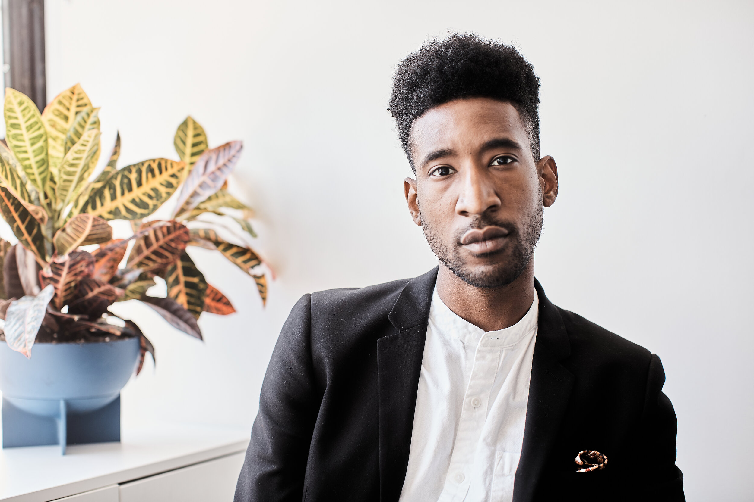
Portrait of Jon Key
Jon Key
Jon Key is an artist, designer, and writer originally from Seale, Alabama. After receiving his BFA from RISD, Jon began his design career at Grey Advertising in NYC before moving on to work with such clients and institutions as HBO, Nickelodeon, The Public Theater, and the Whitney Museum. As an educator, Jon has taught at MICA, Parsons, CCA, and currently teaches at Cooper Union. Jon is also a Co-Founder and Design Director at Codify Art, a multidisciplinary collective dedicated to creating, producing, supporting, and showcasing work by artists of color, particularly women, queer, and trans artists of color. Jon was selected for Forbes 30 under 30 Art and Style list for 2020 and was the Frank Staton Chair in Graphic Design at Cooper Union 2018-2019. His work has been featured in Jeffery Deitch Gallery NYC, the Armory Show, The New York Times, The Washington Post and The Atlantic.
Interview with Jon Key
Questions by Sonja Teszler
Lovely to e-meet you Jon and hope you’re doing well and safe. Firstly, I was wondering if you could talk about how growing up in rural Alabama and your autobiography in general plays into your work?
Nice to meet you too! I grew up in Seale Alabama surrounded by bucolic landscapes filled with acres of grass, tress, cows and horses. Also, I was surrounded by a large family of uncles cousins and elders who lived close by and the Southern Black church community. My mom encouraged my twin Jarrett and I at an early age to paint and do arts & crafts at home. My first real introduction to art was music and theater. Growing up, I was heavily involved in church choir, pageants at school, theater camps, piano, band etc. I loved the idea of making noises that can be interpreted and translated into melodies. Your role or part contributed to a larger orchestration and message.
I think growing up as a young queer kid in the South, you are constantly aware of how your presence and identity is often times at odds with the everyone and everything you learned around you, but it wasn’t until I arrived at RISD where I really begin to dissect my upbringing and the impacts on who I am today. I realized that writing and research is a very important part of my process. I began transcribing my personal narrative for my thesis project at RISD in 2012. I was asking the preliminary ideas that really were the foundation for the work I make now. Then, I was an undergrad student studying graphic design and questioning what unique voice I was supposed to bring to the graphic design world. What did it mean I was a designer from Alabama? What did it mean I was a queer designer? A Black designer? Is there a visual vocabulary that unites these themes? Does any of this manifest in my work? Does it matter? This is where I began. After writing most of the semester as encouraged by my advisor and rereading and editing down the text, I realized that I was interested in making work that speaks to the intersectionality of my identity.
Portraiture has such a specific tradition within the art historical canon in terms of representing intimacy, identity, the Self and the Other. What drew you to painting portraits and how do you choose your subjects?
I have been painting portraits ever since I started painting around the age of 10. I am a twin, and when we younger we would also get mistaken for one another a lot. I think I have been fascinated by discovering the physical differences between my twin Jarrett and myself. In high school, my entire AP project was self-portraits examining my reflection in various domestic objects and spaces at home. Between then, college and now, I only paint people I know. A large number of my paintings are self-portraits, but this has expanded to painting my biological extended family mom, dad and grandfather, grandma and twin. Recently, I have started painting my chosen family who are my closest friends that live near me in New York and I have known for over 10 years.

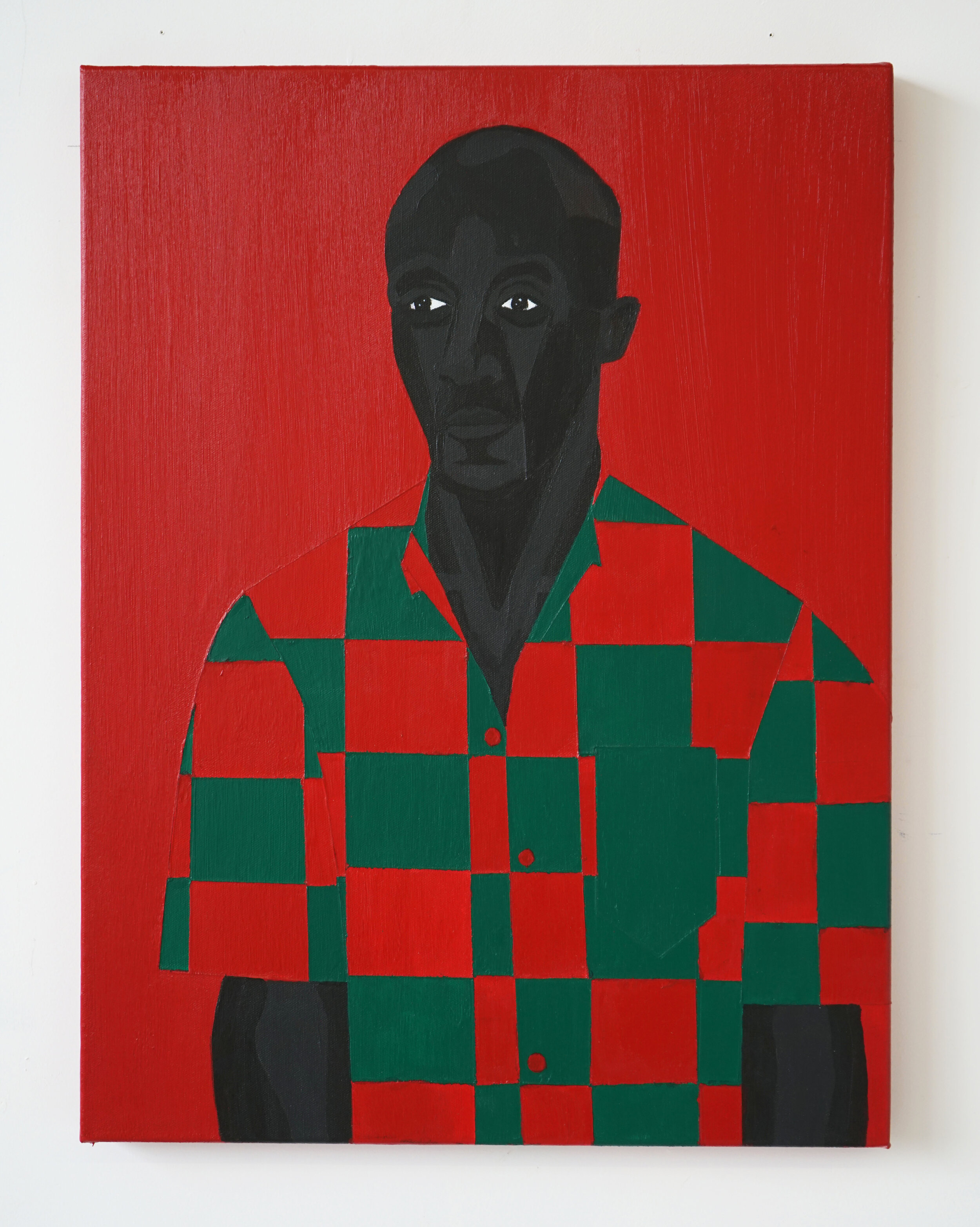
Family Portrait No. 2 (Fred), 2019. Acrylic on canvas, 24 × 18 inches.
You are working with specific colors in your paintings– vibrant red, green and violet, often even coating the exhibition walls to fully immerse the viewer in this palette. What’s the significance of these color choices?
As a writer, designer and painter, my work excavates the lineage and history of my identity through four themes: Southern-ness, Blackness, Queerness, and Family. Through the process of writing, photography and painting, my work is portrayed graphically through four colors: Green, Black, Violet and Red. Respectively, these colors intertwine my memory and intimate recounting of the four pillars grounding the work.
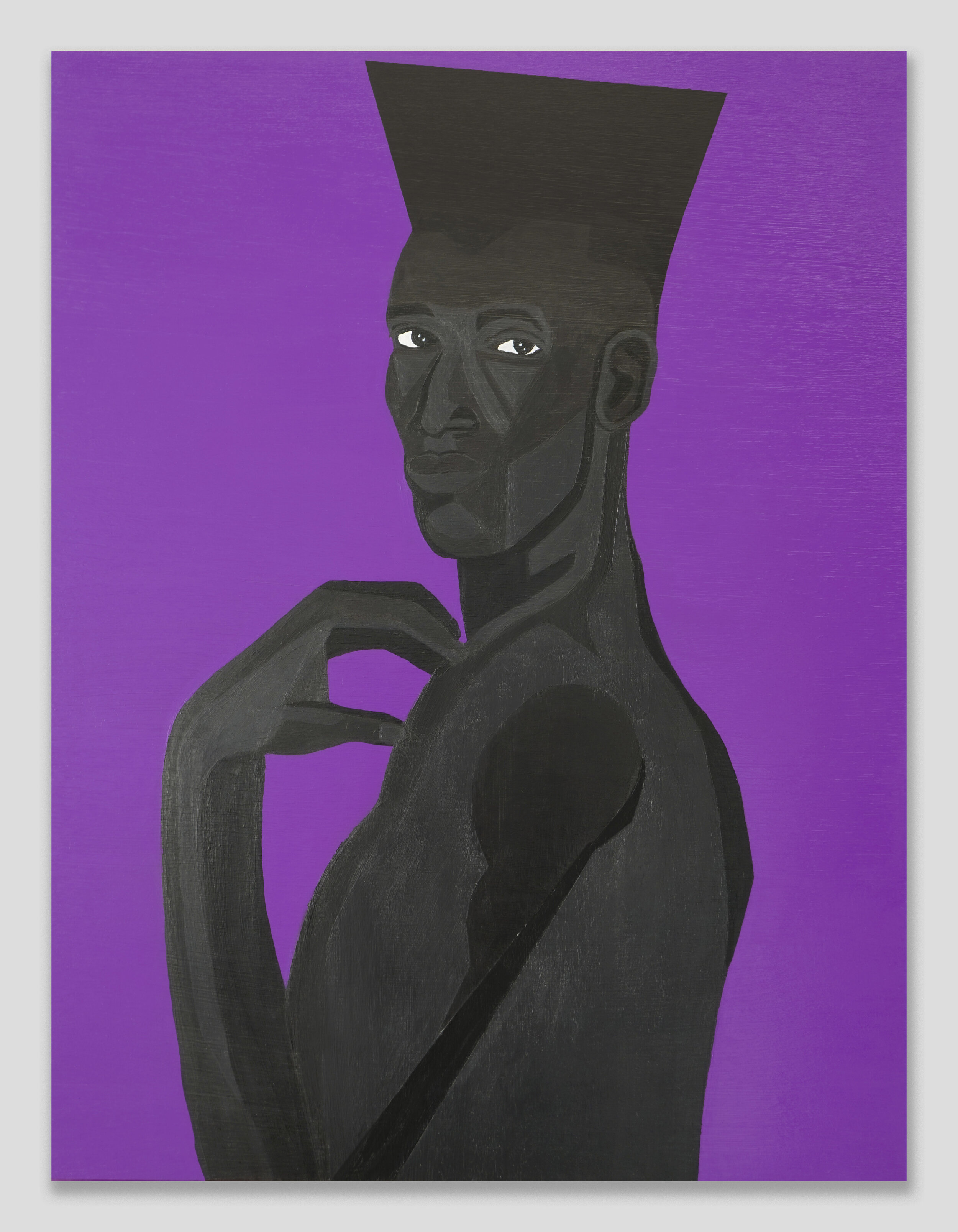
The colors are assigned by historical research and references to my own personal interpretations. For examples Violet is the color that represents queerness. Red and Blue mixed create purple, but Violet is a spectral or “true” color. It doesn’t exist within the binary and has its own set of properties. Throughout history, Violet and purple has been associated as a color of royalty, power and unity. Sappho the ancient Greek poet from the island of Lesbos, writes poems of Queer lovers draped in violet robes or with crowns of violet on their heads. I love the idea that my work is communicating with a lineage of artists and makers from the past, present, and future. The work is grounded in history and my personal experiences.
Are there any artists you’re looking to as inspiration for your work? What’s a piece (be that of any medium) that had an impact on you recently?
I am inspired by a number of Art, design and pop culture references. Of course, master painters such as Picasso, Klimt, and Kerry James Marshall come to mind. More specifically, historical photographic references of Frederick Douglass Portraits and Louis Agassiz Enslaved African Daguerreotypes were early references, with their unnerving gazes back at the viewer, that really engaged the subject’s relationship to power and agency. As a designer, I have always been attracted to posters, specifically Sachplakat, or Object Posters, from the early 1900s. I think all of these objects and artists push composition, simplicity and meaning. Recently, Ian Michael’s paintings are so beautiful to me. I love his use of a limited color palette, rough carved out surface of the paper or canvas, and the seemingly pedestrian leisure of the subjects. I feel that I know the people who are in the painting. I am one of the people he is painting.
Depicting your subjects in various restricted or awkward positions - bent necks, limbs pressed together - is a recurring motif in your paintings. So is using geometric shapes and patterns, locating these figures within a specific structure or compartment on the canvas. What’s your consideration behind these compositions?
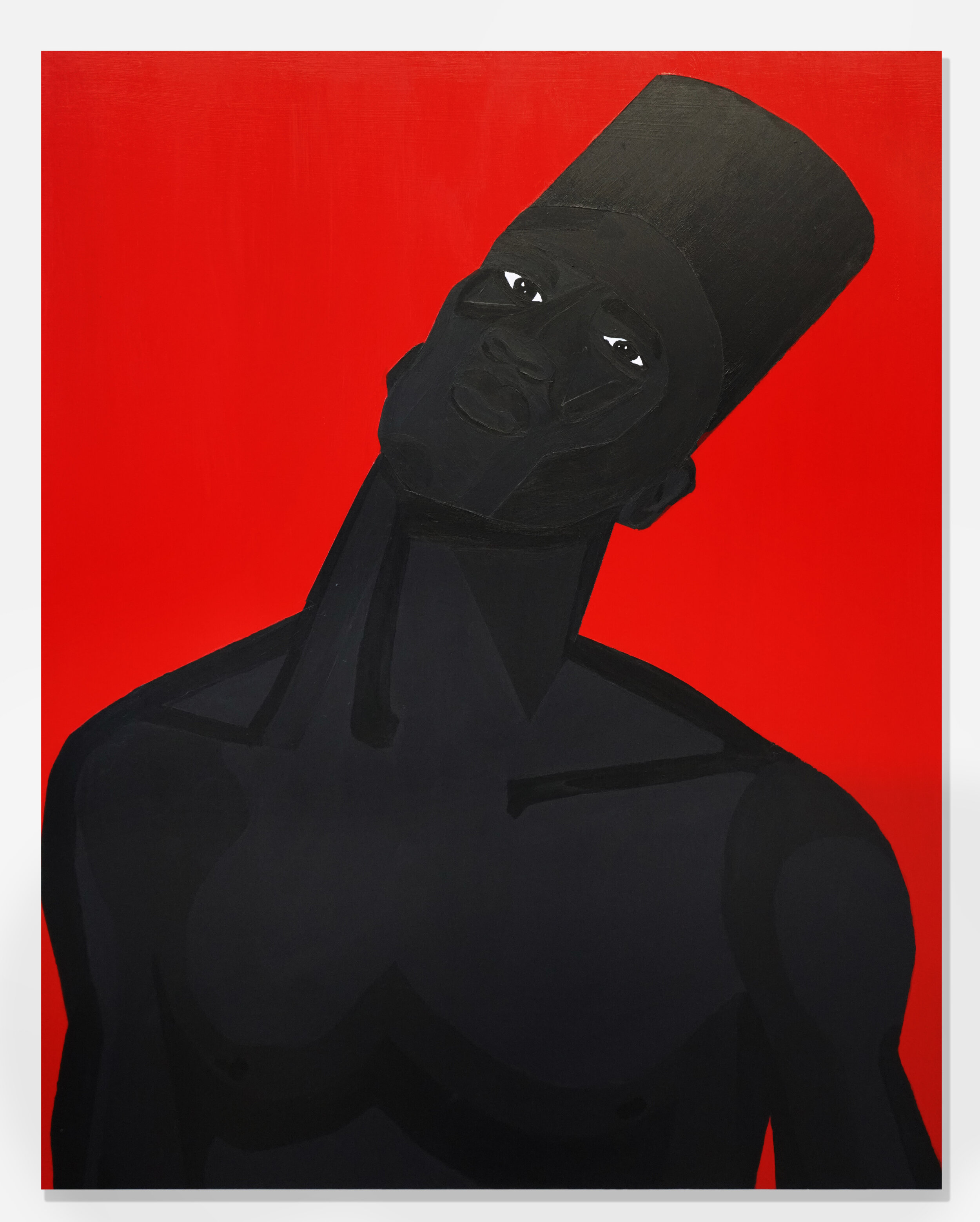
After Orlando Pulse nightclub massacre in 2016, I began examining the spaces and frames in which Queer & Trans People of Color inhabit and claim as safe. The Man in the Violet Suit emerged as a mythology of the QTPOC lived experience. This work really focused on the tension and anxiety of performing and existing as a Queer Black Man. I am very interested in creating flat, graphic, figure and interior/exterior space paintings. My work challenges space, perception and the performance of the figure. The Man in the Violet figure, specifically in my earlier works, responds and contorts to the opaque space that he is, but is looking directly at the viewer with unrelenting strength, power and will. I am very inspired by collage, and my paintings often get confused as collage, but really it is the slow process of layering the paint to create a “Keloiding” or raised line effect. The Polka dots come from my Grandmother's nickname Ruth Mae “Polka Dot” Giles. The plaid square pattern re-interprets my Father’s “uniform” he would wear to work as the owner of his own construction company. There is always a Black Power fist and open hand gesture by the figure. The figure is always barefoot. All of these are symbols and messages retelling specific memories as it relates to my family, identity and society.

The Man in the Violet Suit No. 14 (Violet Bedroom), 2020. Acrylic on panel, 36 × 72 inches.
Your 2019 exhibition at the Rubber Factory in New York had the title “Violet Mythologies and Other Truths”. What is your work’s relationship to creating or challenging mythologies?
The Man in the Violet Suit mythology was started to process and deal with much of what was going on in the United States during 2016. There was a lot of fear and anxiety responding to mass shootings, police violence and the stripping of LGBTQ + rights. As I continued to build the world for this character, I realized I can create spaces that reflect my community and what I wanted to see in the world. The 2019 exhibition was the first time I painted the Man in the Violet in fully realized in a dreamscape world. This character, who in previous works, was stifled by the frame, finally has escaped to explore and discover a world made for him. I love the idea of building a narrative fused with my own memories and reminders of home, but this narrative frame allows distance between my actual life and the paintings and stories I am sharing. Myths are stories rooted in heritage and specific lived experiences. I love that I can construct, shift and alter my story. I have full agency and control.
Now, I am delving deeper into the paternal and maternal multi-generational relationships of my family. Meditatively, I use layers of paint to create opaque planes that reveal and conceal our pasts. The contorted, flattened figures in the paintings question the events taking place and implicates the viewer. Referencing childhood photos and re-compositing portraits of the “archs” of the family, I am revisiting the fractures and secrets of our family tree to build empathy and regain agency. Simultaneously, as I climb through my family history, I am also examining my own body in private spaces. “The Man” portrait series asks who am I stripped away from projected identities? How can I find freedom and liberation existing in my own skin? In this series, the figure is stretching, posing, and readjusting for comfort. He is aware of the viewer but is too consumed with his own ritual to confront. He is vulnerable, but strong. He is practicing self-love.
As someone who is also a successful designer alongside being a painter, how would you compare the fields of contemporary art and design? Do you think design has more potential in reaching a wider audience?
This is a good question. I think in some ways graphic design is ubiquitous. It’s everywhere and not something one might think about constantly. Good design is almost invisible and works hard to be useful for as many people as it can. Design has to be clear. Design controls traffic flow, helps us when we are lost and allows us to clearly understand what we are consuming or buying. Design is a service for all us. Art, for me, communicates history, a story and emotion. It doesn’t have to be useful or provide helpful information. “Legibility” doesn’t exist. You don’t have to “get it”. There is a very large range of what is considered successful and powerful. Art, perhaps, can be more impactful emotionally. Art is much more subjective. Unfortunately, Art is often limited to museums, gallery spaces or in the homes of those that can afford it, so in many ways is not the most accessible to everyone (at least experiencing it in person). There would be no art without design and no design without art. Both, design and art, are primary historical documents of the world at that time.

Jon Key in the studio.
Could you talk about what design means to you specifically – how did you become interested in it and what’s its potential in how our public spaces, visual culture and identity is shaped and expressed?
I became interested in design also at the age of 10 (but I did not know it was Design at the time.) My mom brought home a HTML book recommended to us by one of her co-workers. I immediately latched on to coding and creating websites. I loved the idea that this text language can translate to visual images and interactions. I also loved that I could create these webpages that could be accessed by other kids like me! This obviously translated to me making graphics and gifs for my sites as well. It wasn’t until high school, after viewing the SCAD college prospectus book from an upperclassmen friend, that I realized graphic design was a career path and I could study and make money doing it.
You and Wael Morcos jointly run Morcos Key design studio in Brooklyn - could you talk about how this started and some of the projects you’ve worked on that stand out?
Wael and I met at RISD in 2012. Since that moment, we have been working together. Originally, our duo started assisting one another with class assignments, and graduated to collaborating on freelance work together after we moved to NYC. In 2017, our friends Andy Chen and Waqas Jawaid at Isometric Studio recommended us for a job and we got a call from Ellen Lupton to design an exhibition at the Cooper Hewitt Design Museum. We had to be registered with the government in order to do business with a Smithsonian institution. Immediately after the call we went online and registered our studio and Morcos Key was born.
I get the impression that Morcos Key is more of a community than simply a business. Creating collaborative and socially engaged spaces like this are extremely important in nurturing the Arts community today. Your other project "Codify Art" is similarly if not even more actively about creating inclusive spaces foregrounding artists of color, particularly women, queer, and trans artists - could you talk about this project?
Codify Art is a Brooklyn based QTPOC (Queer and Trans People of Color) artist collective. It was started by my group of friends Leandro Zaneti, Sharina Gordon, Son Kit, and Jarrett Key (all RISD and Brown University students) who moved to Brooklyn and needed to figure out ways to continue our artistic practices in our new home. As an artistic, curatorial, and producorial organization, our mission is to showcase work by artists of color, particularly women, queer, and trans artists of color. We have produced gallery shows with Spring/Break art fair, workshops at Yale and the Whitney museum as well as open mic nights and networking events. We believe the existing vocabulary of the arts and society at large often proves inadequate for engagement with the stories of marginalized groups. Codifying builds an alternative, inclusionary language with which the artist can communicate their experience and through which the viewer can understand and respond. We clear common ground; we teach, learn, and teach continuously. It is very important to be able to work in and give back to my community. I think as designers we are often limited to doing client work and projects that maybe don’t directly impact the people we want. Working with Codify Art and having this great team of collaborators and artists, really help each of us expand our personal practices and, as a whole, uplift so many more artists.

Codify Art, Brooklyn, NY.
Consistently so, but especially following the recent momentum of Black Lives Matter, the global art establishment has been called out on many structural and institutional levels regarding issues of representation. As someone who's engaged with this topic across your different practices, do you feel hopeful about a progressive shift happening as a result?
I feel every day the world is becoming more aware of their roles in oppression and structural racism. This does not mean the end is in sight, but I hope that the continuation of self-education, financially supporting QTPOC/BIPOC artists and organizations, and advocating for greater empathy for each other will continue to build.
Being active on so many fronts (including also teaching), did it feel challenging at any point to balance your energy between your creative process of painting and your other projects?
This is the number one question I always get. HAHA I don’t have a good answer, I am afraid. I am very good at managing my schedule and expectations with my collaborators and team. The best part about running your own business is that you are fully in control of your time and appointments. I use this to my benefit by prioritizing major tasks at hand. Also, it is important to always ask for help. I could not complete half of my to do lists if I was not supported by Wael, all of my friends, designers/freelancers and family.
Do you have any projects coming up that you're excited about?
I am getting ready for an online duet show at Steve Turner Gallery with my twin Jarrett, who just graduated from RISD MFA in painting. I am also getting ready for a group show with Carl Freedman Gallery in Margate UK curated by Russell Tovey opening in November. In December, the long awaited book Black Futures edited by Kimberly Drew and Jenna Wortham will be out! This over 500 page book asks: What does it mean to be Black and alive right now? In its final form, the book includes a luscious set of artworks, essays, interviews, recipes, poetry, archival tweets and more from over 100 contributors that tells the story of the radical, imaginative, and resilient world that emerging and renowned Black artists are producing today. I am very excited to see this out in the world! It was very much a labor of love and we worked so hard to create something timely and beautiful.